

Bakery App
Timeline
March 2025 – April 2025
My Role
UX/UI Designer
Platform
Figma
Project overview
The Product
A Bakery app for customers to place orders online and earn reward points.
The problem
Users need a way to order their food online as the current in-store experience lacks digital support, leading to long wait times and queues.
The goal
To create a bakery app that enables quick ordering, food pickup, loyalty rewards, and personalised offers.

Process
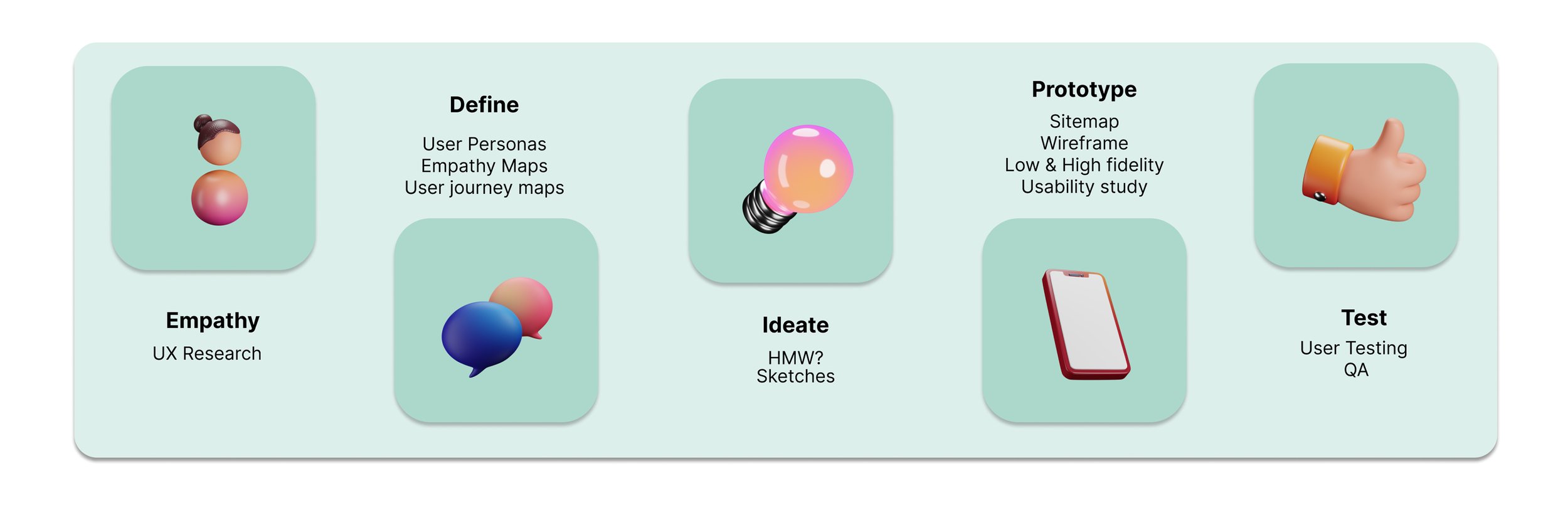
Understanding the user
User research: summary
To understand user requirements, needs, and pain points, I conducted interviews and for my project. My goal was to gain an understanding of users needs and wants. As well as to identify the key features they would want in a bakery app. For the research I used both qualitative and quantitative research including questionnaires and face to face interviews.
User research: pain points
Long Wait Times
Long wait times in the queue causes frustration. Users want to order food quickly and pickup the food from the bakery or have it delivered to work or their home.
Loyalty Tracking
Users feel that they spend a lot of money in the bakery but don’t get any benefits and would like to receive discounts for being a loyal customer.
Stock Availability
Users feel disappointed when their favourite food is out of stock and would like to receive notification if the food is out of stock.
Payment & Checkout
Users feel that prices are different and would like to see fixed prices before coming to the bakery and placing an order.
Persona 1
Sarah
“the busy professional”

Persona 2
Chris
“Proactive trainer”

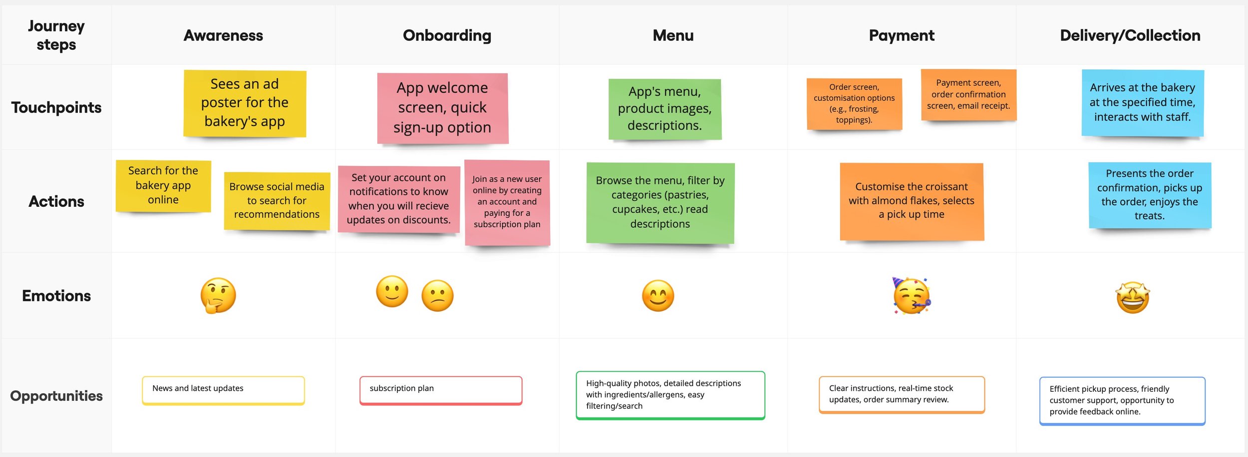
User journey map
I created a user journey map to show the steps Sarah and Chris takes to accomplish their goals when they address their pain points
Empathy map
I used an empathy map to understand what the user says, think, does or feels when they want to order bakery.

Findings

How Might We
I created a “How Might We" (HMW) strategy for the mobile bakery app. To help with turning user problems into solutions and ensuring the design will meet their needs.

Moscow Analysis
I decided to use the Moscow analysis to prioritise features and tasks that would be important for the user.

Starting the design
Sitemap
I created a site map as the primary pain point was users did not like long queues and want to save time in order food. My aim was to make an information architecture to help structure content and clear navigation for the users that will help them save time when ordering online.

Paper Wireframes
At first i drafted each screen on paper then decided to use Fig jam. I created five different version of the same screen then after feedback chose the 5 screen to use.

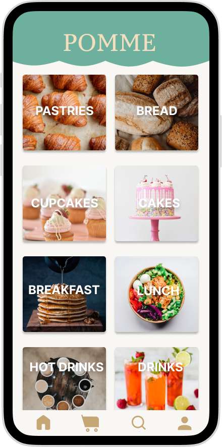
Digital wireframes
To make the digital wireframes, I put my ideas on paper first then used Figjam to create multiple iterations that related to the users experience. This is one of the wireframes that related to the users needs and expectations in a feature bakery app.


Low fidelity and High fidelity prototype
I created diagrams and low-fidelity wireframes to test the functionality and user experience before moving on to the high-fidelity, final designs.


Usability study: Parameters
I tested the high-fidelity prototype with 5 users to observe how easily they could complete key tasks and navigate the app.

Usability study: findings
After testing I found that there was still information missing such as a search button and checkout screen.

Refining the design
Mockups
Based on the insights from the usability study, I applied changes such as switching the heart to a search and adding the edit or delete to make it easier for users to search for certain bakery. I also added the edit and delete sign to save users time from selecting cancel order by adding edit.

Before

After
Final designs
Once I completed the low-fidelity prototype, I created the final design and focused on selecting colours and fonts that related to the essence of the bakery sh


Accessibility considerations
When choosing typography, I used two typefaces: Inter and Sans Serif. To ensure clear text visibility, I implemented a text hierarchy, allowing users to easily distinguish sections and information on the screen.
Colour Palette

Going forward
Takeaways
Impact:
Users shared that they were happy with the as it reflected the bakery store and the brand.
What I learned
I learned that it’s best to always focus on the users needs and to be able to meet their requirements.