
Project Overview
This project was completed as part of the Google UX Design course.
The Product
The goal was to design an online banking app that allows users to easily set up direct debits, manage savings, and make secure online purchases. The focus was on creating a clean, intuitive interface that supports everyday financial tasks with ease and clarity.
Timeline
March 2025 – April 2025
My Role
UX/UI Designer
Platform
Figma
The Problem
Users feel online banks lack customer service support and would like an app and website where they will receive 24 hours support from customer service.
The goal
Design an app and a responsive website for a bank that helps customers select, set up, and manage a personal bank account without visiting in person.
Process

Understanding the user
User research: summary
To understand user needs, behaviours, and pain points, I conducted interviews and applied both qualitative and quantitative research methods. The goal was to uncover what users look for in an online bank that will make them set up an account and manage expenses online.
User research: pain points
Security concerns
Users feel logging into their banking app on public Wi-Fi could put their personal information at risk.
Technical issues
Users feel that apps can be vulnerable to attacks, especially if they lack strong security measures.
Lack of customer support
Users feel it’s difficult to contact customer services online as some banks close early.
Findings
80% of users use personal banking for payments, savings, direct debit.

70% of users preferred method of customer support is phone calls and 30% preferred live chats.

90% of users have more than one bank account.

Persona: Joey
PROBLEM STATEMENT
Joey is a Sales Manager working toward buying his first home. While he’s earning a steady income, he finds it challenging to balance saving with paying monthly bills. He’s looking for a smarter, more structured way to manage his money and reach his goal faster.

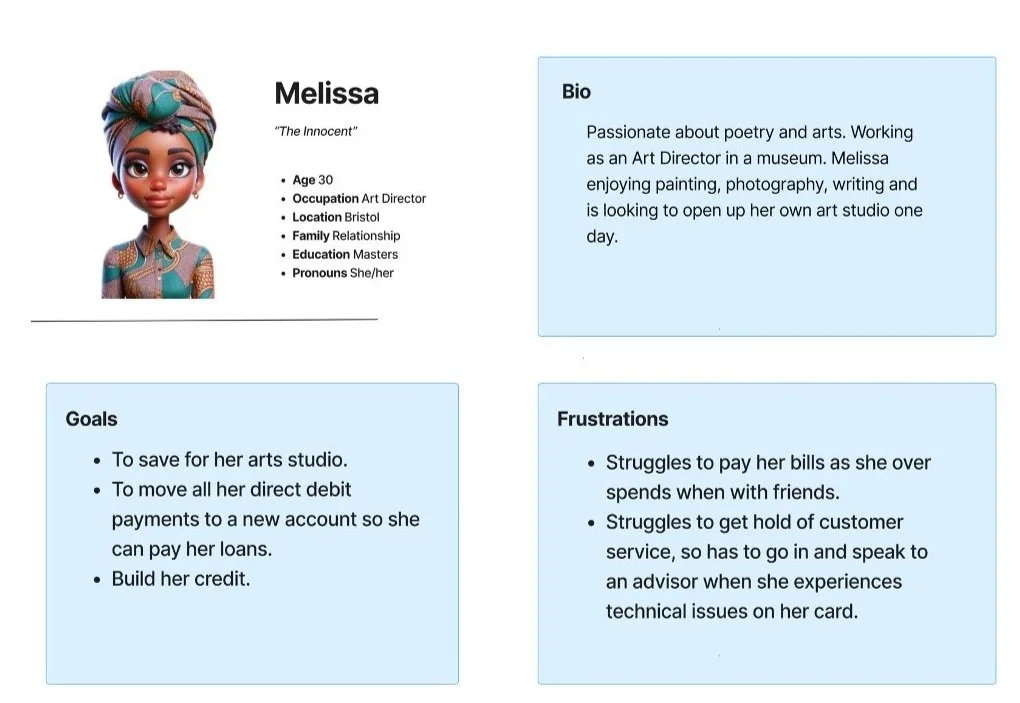
User persona: Melissa
PROBLEM STATEMENT
Melissa is an Art Director saving to open her own art studio. But managing her finances through her current bank is frustrating — juggling bills, unclear fees, and limited credit options makes it hard for her to stay on track.
Empathy Map
I used an empathy map to understand what the user says, thinks, does or feels when they want to sign up to an online bank account.

User journey map
Goal: To create a User Journey Map for the user, creating an account to save money and manage expenses.

Starting the design
Site map
I created a sitemap to organise and structure the content. To make sure I could see a clear structure of how customers could set up the account without visiting a branch.

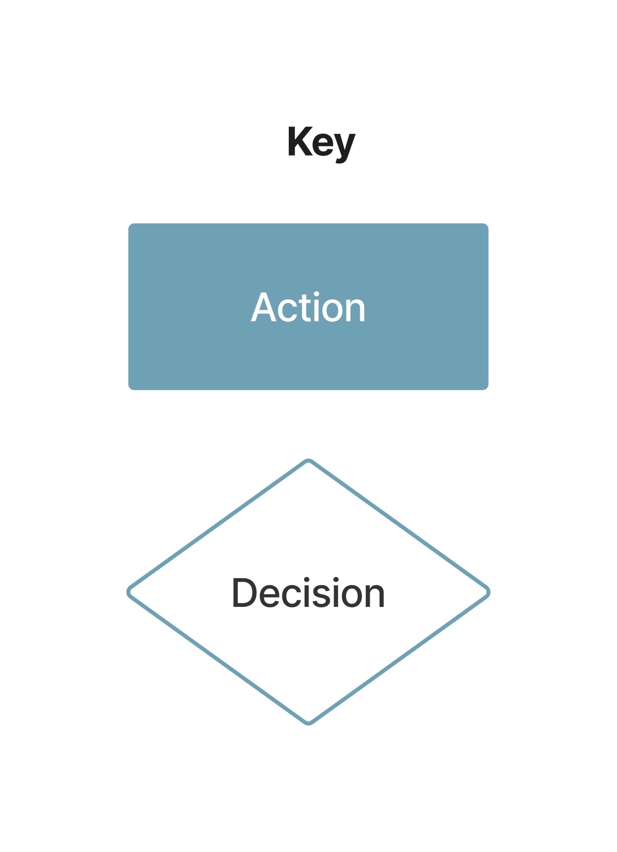
User flow chart
After creating a sitemap, I then created a flow chart to visually map out the user journey online. Making sure there is a clear step by step process the user takes to open up or log in to their account.

Paper wireframes
I created wireframes to visualise the layout, structure, and user flow of the website and mobile app, helping to define how each screen will look and function before moving into design and development.

Digital wireframes
I started with sketches, then used FigJam to create low-fidelity wireframes to focus on the key features for the website and app.


Refining the design
Mockups and Usability Testing
While testing the mobile app and website, I noticed several users felt the colour of the button wasn’t visible enough, and the logo didn’t stand out. So I removed one of the buttons and added effects to highlight the logo.

High fidelity
After finalising the low-fidelity prototype, I moved on to high-fidelity designs, and chose specific colours that would reflect the brand and show trustworthiness of a banking experience.


Colour Palette


Responsive website

Mobile
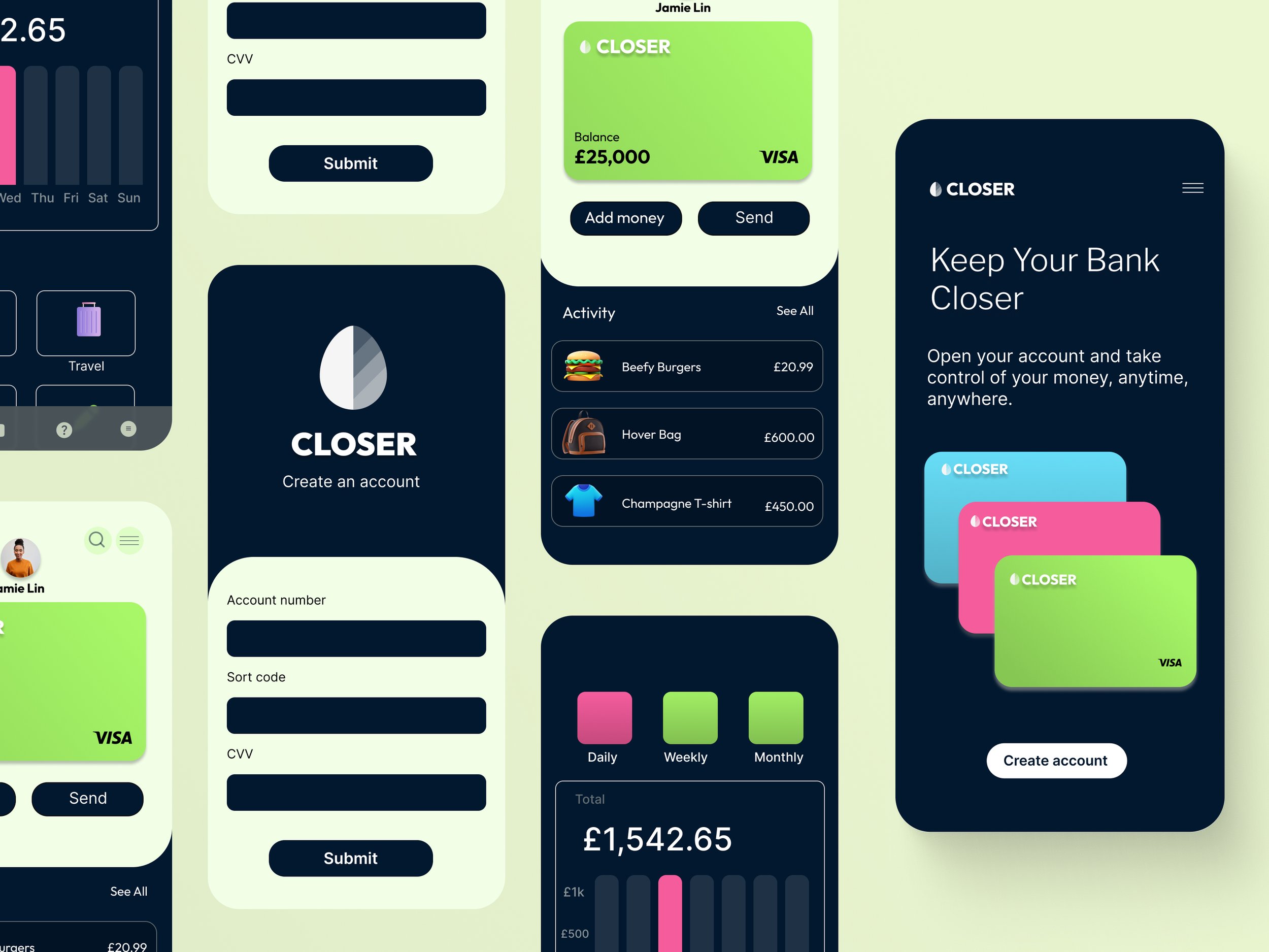
High Fidelity - Mobile App


High Fidelity - Responsive website


Accessibility considerations
When choosing typography, I used two typefaces: Inter and Sans Serif. To ensure clear text visibility, I implemented a text hierarchy, allowing users to easily distinguish sections and information on the screen.
Going forward
Impact:
Users were happy because the design felt easy to use.
What I learned:
I learned that it’s best to always keep features simple and most importantly user friendly for all types of users.
Let’s connect!
It would be great to hear your thoughts on this project, as feedback is always important in deign